

Recently, a new, 4th version of Bootstrap was released and in this article we'll make a quick overview about what's new in this version, how it differs from version 3 and how it will affect the development of sites.
In a case you didn't know, Bootstrap is an HTML and CSS based framework, which contains styles for the main elements that are used in the layout. The advantages of using such a framework are that it can significantly speed up the process of creating web pages and sites. Standard styles are easy to change, which provides a flexible and simple process for creating new site layouts.
Today both versions 3 and 4 of Bootstrap are a powerful CSS framework for creating adaptive pages, which includes a multi-column adaptive grid, ready-made elements for navigation, buttons, dropdowns, a set of service classes for controlling the behavior of the elements, some javascript plugins like carousel, modal etc. and many others.
But despite the almost identical set of components and utilities, there are actually some quite important differences between version 3 and 4. The first important change is that the source code for Bootstrap 4 is not written in Less, but in Sass. And this is actually a good advantage since today Sass is recognized as the most widely used CSS preprocessor and the code written with it is more readable and understandable.
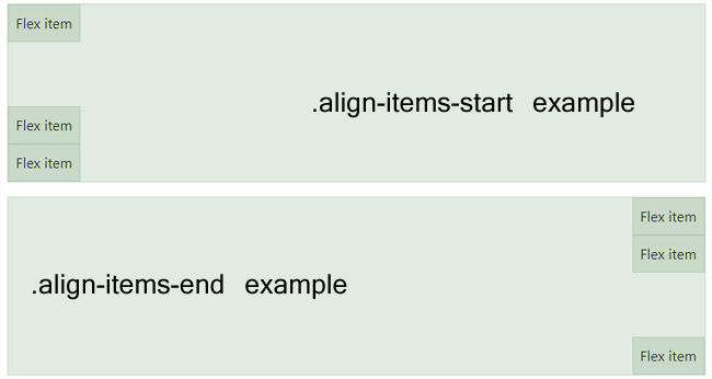
Probably the the most important functional difference between Bootstrap 3 and 4 is that Bootstrap 4 now uses flexbox, instead of floats, to handle the pages layout. This helps to solve previous issues with aligning vertically the page, problem of columns having the same height and others - this is a broad topic, which we won't discuss here, but if you wish we can check many different examples or more details about that on the Flex details page on the official Bootstrap website. https://getbootstrap.com/docs/4.0/utilities/flex/
Please note however that IE version 9 or older doesn't support that, so if you would like to target also the older versions of IE, it's better to stick with Bootstrap 3.
Another big advantage is that it makes the columns management easier and now for example to create columns with the same size, it's possible to just use the new .col class and it is also possible to create columns that change their width according to the width of the content - to do this, it's necessary to add the class .col-md-auto
Also something new are the new breakpoints for the responsive design - there are now 5 instead of 4 and the sizes are changed:
Extra Large >= 1200px
Large >= 992px
Medium >= 768px
SM >= 576px
XS < 576px
In the Bootstrap 3 these breakpoints were only 4 and this sometimes created some problems with the content on tablets with smaller screens or for example phones with a huge screen.
Another change in Bootstrap 4 is that the panels, wells and thumbnails are replaced now with a new element - the cards.
According to the definition on the official Bootstrap site "A card is a flexible and extensible content container. It includes options for headers and footers, a wide variety of content, contextual background colors, and powerful display options. ".
It was done to make the markup easier since it was unnecessary to have different elements for these small elements.
So in the practice for example now instead of using the .panel and .panel-body classes, it's possible to use .card and .card-block at their place.
Something new important introduced in Bootstrap 4 is the usage now of rem and em instead of pixels.
Pixels gave way to rem and em, and this is one more step towards better display of the site on mobile devices, when the size of the letters and indents depend on the screen size. For example now instead of specifying font-size: 19px; you can use font-size: 1.2em; or font-size: 1.2rem; (please note that while em is relative to the font size of its direct or nearest parent, rem is only relative to the html (root) font-size)
All JavaScript plug-ins were rewritten in new Bootstrap in order to be with accordance with ES6 requirements, which makes the code more structured, faster and more reliable.
There are also changes in forms and now for example dropdowns can be built with
divs or uls , .btn-default is replaced with .btn-secondary, some classes like btn-xs and others are dropped and also other small changes for better display of the form elements on the different devices.
There are also many other small changes like adding new classes for indenting, possibility for new customized form controls, dropped the Glyphicons icon font, dropped the page component (since these were just customized buttons) etc.
If you currently have a site or template created with Bootstrap 3 and you would like to quickly migrate it to Bootstrap 4, you may consider the following steps (for the most commonly used elements):
- Change the image classes, rename all .img-responsive to .img-fluid (or also .img-rounded to .rounded and .img-circle to .rounded-circle)
- Forms, if you use .control-label this should be renamed to .col-form-label and also .input-lg and .input-sm to .form-control-lg and .form-control-sm
Also .checkbox and .radio classes should be replaced with .form-check
- Buttons, replace .btn-default with .btn-secondary and .btn-xs with .btn-sm (since .btn-xs class doesn't exist at all in Boostrap 4)
- Panels, it's necessary to replace all .panel with .card, .panel-heading with .card-header, .panel-title with .card-title, .panel-body with .card-body and .panel-footer with .card-footer
- Carousels, the following changes need to be be done to migrate the code from v3 to v4 - replace .item with .carousel-item, .next, .prev, .left, and .right with .carousel-item-next, .carousel-item-prev, .carousel-item-left, and .carousel-item-right
- Others, .hidden and .show have been removed (in order to avoid conflict with jQuery and the show and hide methods there), so they can be replaced now with inline styles like style="display: none;" and style="display: block;"
Also all sub classes like .hidden-xs .hidden-sm .hidden-md .hidden-lg .visible-xs-block .visible-xs-inline .visible-xs-inline-block .visible-sm-block .visible-sm-inline .visible-sm-inline-block .visible-md-block .visible-md-inline .visible-md-inline-block .visible-lg-block .visible-lg-inline .visible-lg-inline-block were removed, so if used previously need to be replaced now with appropriate css
To find out more details about the other updates, you may visit the official getbootstrap.com website and if you wish, you can also download our free Blog Lite script, which can be used to create simple blog sites and is coming with a Bootstrap 4 template.