Dark mode and mobile design
Blog Lite 2 adapts to phones, tablets and desktops, and offers a dark mode that visitors can switch on or that you can set as the default.
Your blog looks good on every screen, in bright rooms and at night.
Dark mode
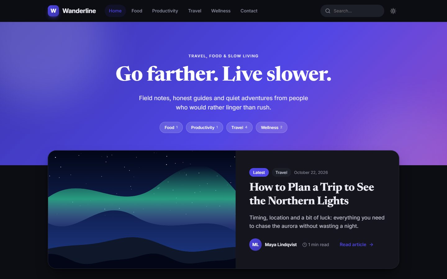
Visitors can switch between light and dark with the moon/sun button in the header. Their choice is remembered in their browser.
You decide what visitors see the first time in Settings → Appearance → Default theme:
| Option | Result |
|---|---|
| Follow the visitor's device | Dark if their phone or computer is set to dark, otherwise light. This is the default. |
| Light | Always starts in light mode. |
| Dark | Always starts in dark mode. |
See Appearance.
Mobile and tablet
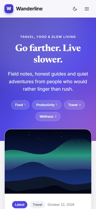
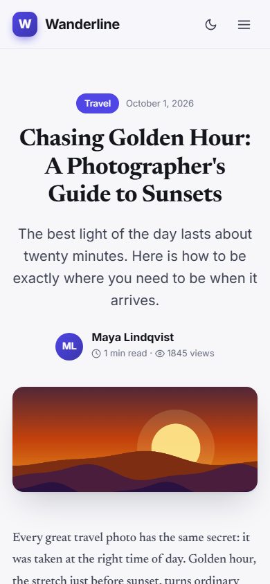
The layout adapts automatically. Cards stack into one column on phones, the menu collapses into a button, and text stays easy to read.
Good for search engines
Search engines prefer sites that work well on phones. Because Blog Lite 2 is responsive out of the box, you do not need a separate mobile version.
The admin panel is responsive too
You can write and moderate comments from a phone: the sidebar becomes a slide-out menu.
Last updated