Mobile and responsive design
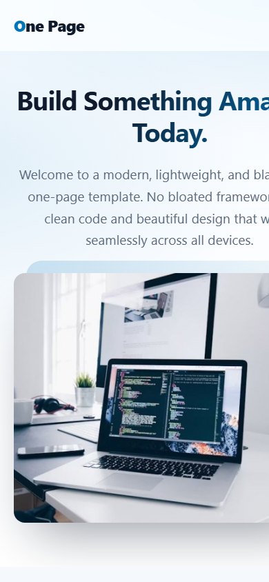
More than half of web visitors use a phone. Every template adapts automatically; there is nothing to configure.
What changes on a small screen
- Menu: becomes a button with three lines. Tap it to open the full menu; tap a link or press Esc to close it.
- Hero: text and picture stack vertically and the text is centred.
- Grids: features, team, pricing and testimonial cards flow into a single column.
- Slider: shows one large slide at a time that you can swipe with your finger.
- Gallery: thumbnails shrink to fit; tap one to open the lightbox and swipe between pictures.
- Contact form: fields use the full width and the right keyboard (email, text).
Tips for great mobile pages
- Keep section titles short so they fit on one or two lines.
- Use images that are at least 1000 pixels wide; the script creates smaller thumbnails for fast loading on phones.
- Do not put long text in the button label.
- Test your website on a real phone after major changes.
Performance
Pages use lightweight CSS and a small script, with no heavy framework. Images below the fold load only when needed (lazy loading) and uploads are compressed automatically, so your website stays fast on mobile connections.
Last updated