Section types overview
Your page is a stack of sections. Each section has a type that decides its layout and which fields you fill in.
The ten section types
| Type | Best for | Guide |
|---|---|---|
| Information | Hero banner, about us, any text with a picture and a button | Information and hero |
| Features | Benefits, services, "why choose us" cards | Features |
| Gallery | Photo portfolio with lightbox | Gallery |
| Slider | Showcase projects or products with larger pictures | Slider |
| Team members | People, roles and photos | Team |
| Testimonials | Customer quotes and reviews | Testimonials |
| Pricing plans | Packages with feature lists and a highlighted plan | Pricing |
| FAQ | Questions and answers in an accordion | FAQ |
| Call to action | A bold closing message with one button | Call to action |
| Contact | Contact form with phone, email and address | Contact |
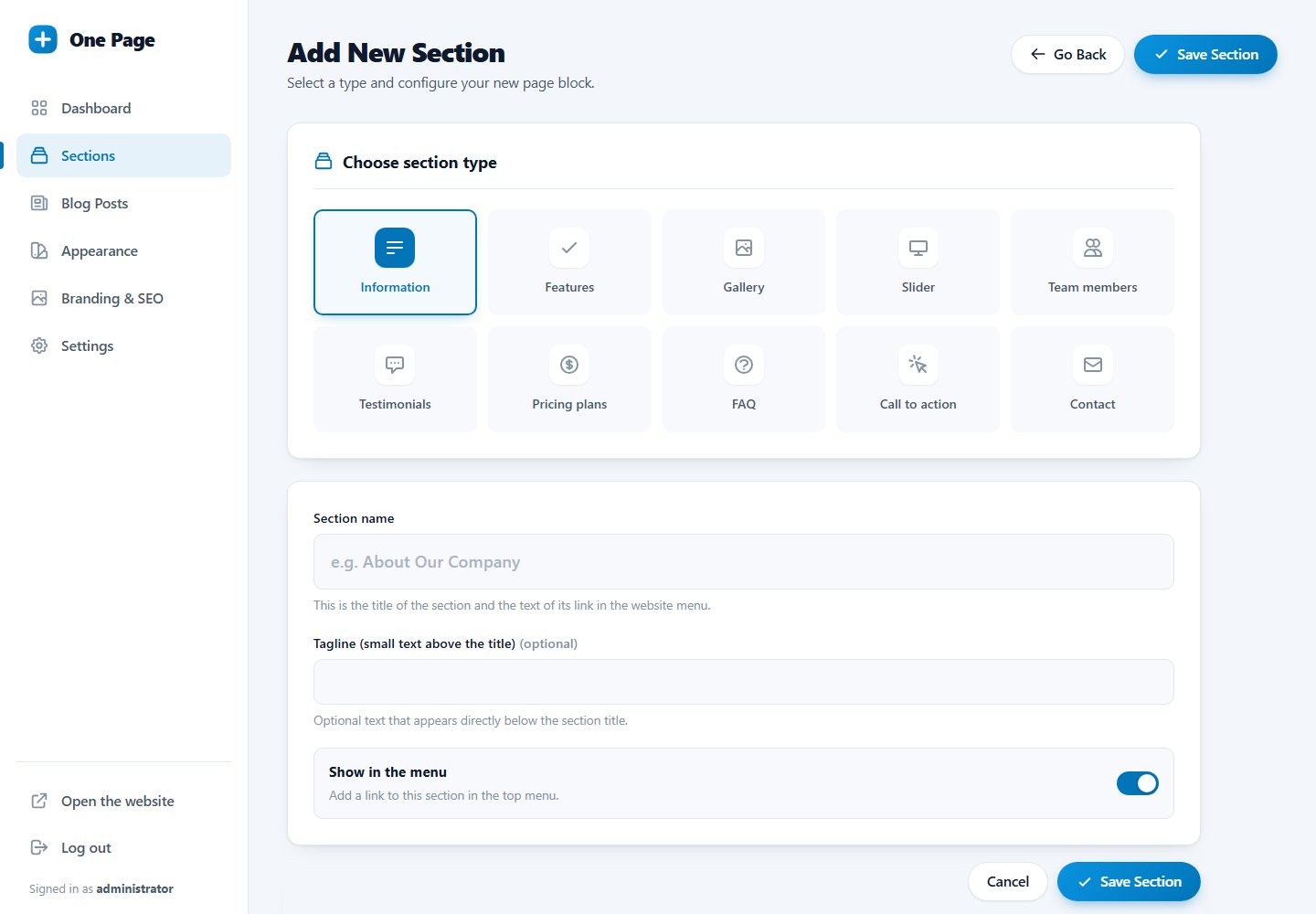
Fields every section has
- Section name: the headline of the section and the text of its menu link.
- Subtitle: optional line below the headline (for Information it is a small "tagline" above the headline). Not used by Call to action.
- Show in the menu: controls whether the section gets a menu link.
Good to know
- You can use the same type as often as you like, for example two galleries.
- The type of an existing section cannot be changed. Add a new section of the right type and delete the old one.
- The order of sections on the page is the order on the Sections list.
Typical page: Hero (Information) → Features → Gallery → Testimonials → Pricing → FAQ → Call to action → Contact.
Last updated